
A Simple Visual Tool to Help Frontline Teams See and Improve Process Performance
Frontline teams often struggle to see how their processes behave over time. Data exists, but it is usually buried in systems, dashboards, or reports that do not support daily learning. For many years—in both manufacturing and healthcare—I have used a simple visual method that helps teams see process performance clearly, identify meaningful patterns, and target the right experiments to improve their work.
The tool requires nothing more than a pencil, a highlighter, and an 11x17 sheet of paper. Despite its simplicity, it has helped hundreds of teams understand their processes more deeply and take purposeful action to improve them. It is not designed for statistical analysis, although those techniques certainly have their place. Instead, it provides a direct, accessible way to visualize daily performance and build the discipline of learning as part of the daily work.
Below is a description of the key elements of the tool and how they work together.
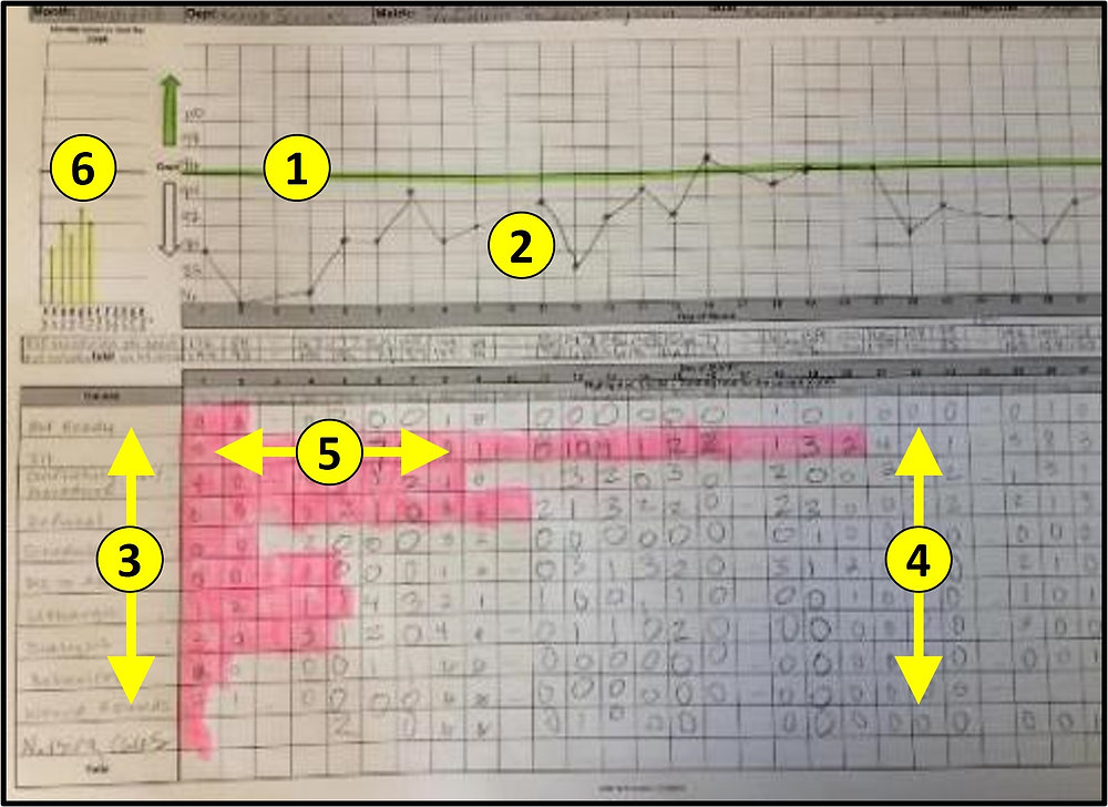
1. Process Performance Goal
Every visualization starts with a clearly defined performance goal. The definition of the goal is important enough to warrant its own dedicated discussion, but for this tool, the key is clarity.
The team must understand:
What outcome are they trying to achieve
What “good” looks like
How performance will be measured
This clarity anchors the rest of the chart. Without a common goal, the team cannot meaningfully evaluate performance or identify problems in real time.
2. Daily Performance for the Month
The next component is a simple daily tracking line or bar representing actual performance for each day of the month.
This gives the team immediate visibility into:
- Daily variation
- Patterns or trends
- Sudden changes or disruptions
- Periods of stability
3. Issues Affecting Process Performance
As daily performance is recorded, the team also documents the specific issues that impacted the outcome. These are not root causes; they are events or conditions the team observed that influenced the result.
Examples may include:
- Equipment downtime
- Missing materials
- Staffing challenges
- Rework
- Delays from upstream processes
4. Issue Occurrence or Impact
For each documented issue, the team records either its occurrence (how many times it happened) or its impact (the magnitude of its effect), depending on what makes the most sense for the process.
This could be:
- A mark for each occurrence
- A time-based estimate of impact
- A simple severity rating
5. Aggregated Pareto of Issue Occurrence or Impact
As the month progresses, the issue data is aggregated into a simple Pareto chart. This daily-updated visualization shows the team where the most frequent or most impactful issues reside.
This step is essential for developing focus. Instead of guessing which problems to solve or running improvement activities based on anecdote, the team uses real data from their own process to determine where to conduct root cause analysis and where to experiment.
This is where the combination of simplicity and discipline becomes powerful. Over time, patterns emerge. The team discovers that the same issues create a disproportionate effect, and targeted problem-solving on those few issues drives meaningful improvement.
6. Prior Months’ Performance
The final component is a visual record of the previous few months of performance. This allows the team to:
- Spot long-term trends
- Compare improvements or regressions
- Check whether experiments have sustained impact
- Link performance to seasonal, staffing, or demand variations
Why This Simple Tool Works
This visual method works because it brings people closer to their process. Rather than relying on dashboards or system-generated reports that often delay learning, teams use fresh facts from each day. The act of plotting performance and issues by hand is not a waste of time—it is a core learning activity.
Teams become more aware of how their work behaves. Leaders gain insight into where support is needed. Discussions become grounded in evidence rather than perception. And because the method is simple and repeatable, it becomes part of the daily routine.
Most importantly, the tool encourages small, frequent experiments. When teams can clearly see performance, understand the issues affecting it, and identify the few factors that matter most, they naturally begin to test ideas, observe effects, and refine their processes.
This is the foundation of continuous improvement.
Closing Thoughts
I have used this simple visual tool with countless frontline teams, from assembly lines to nursing units. Each time, the effect has been the same: deeper understanding, more meaningful conversations, targeted improvement, and higher engagement.
When teams have a clear picture of their process performance—created with their own hands—they become more confident in identifying problems and more capable of improving their work. This not only reduces the burdens they experience but also increases the value delivered to customers and patients.
I hope that the simplicity of this method encourages more teams to adopt it. You do not need sophisticated software or advanced analytics to begin learning from your process. Sometimes, an 11x17 sheet of paper, a pencil, and a highlighter are enough to start transforming the way work is done.
Comments