
Visual Management: Turning Information into Action
In Lean organizations, communication is more than words. It is about making information visible, understandable, and actionable. Visual management is one of the most powerful tools in this regard. It conveys data, trends, and performance in a way that is instantly recognizable and easily interpreted, far more effectively than text-heavy reports or spreadsheets.
At its core, visual management is a form of communication that makes the state of a system, process, or activity immediately apparent. When done correctly, it not only highlights what is happening but also engages teams in interpreting, learning from, and acting on the information.
The Power of Visual Artifacts
Visual artifacts—boards, charts, color-coded signals, and silhouettes—provide quick recognition of information while promoting deeper understanding. People can absorb visual cues rapidly, make decisions based on them, and coordinate actions without lengthy explanations. This immediacy is crucial in fast-paced operational environments, whether in manufacturing, healthcare, or service industries.
The effectiveness of visual management lies in its ability to make the invisible visible. It transforms abstract data into a tangible representation of performance, risks, or trends. Beyond simply showing numbers, visual management tells a story about the state of the system, enabling teams to act in real time.
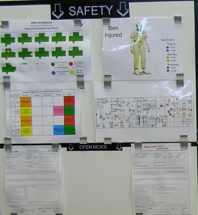
The Safety Cross: A Core Visual Tool
One of the most widely used visual management tools is the safety cross. The safety cross provides a day-by-day representation of safety performance, helping teams track incidents, near-misses, and potential risks.
Typically, the safety cross uses color coding to communicate at a glance:
- Green: No incidents or risks identified.
- Red: Category 1 incident (major injury or event).
- Yellow: Category 2 incident (minor injury or near-miss).
- Blue: Near-miss or potential hazard detected.
By simply glancing at the safety cross, teams can immediately see trends over time—clusters of red or yellow days may indicate underlying systemic issues that require investigation.
The safety cross not only informs but prompts questions and reflection: Why did incidents occur on certain days? Are there patterns tied to shifts, tasks, or equipment? The tool makes the system visible, allowing teams to proactively address risks.
Adding Context: Body Part Silhouettes
A second layer of visual management enhances the information provided by the safety cross: the body part silhouette. Using the same color coding, the silhouette shows which part of the body was affected in an incident.
This layer allows teams to identify patterns in injuries that might not be apparent from the safety cross alone. For example, multiple yellow marks on the hand might suggest repeated minor injuries linked to a specific task or piece of equipment.
By visually representing the affected body part, the silhouette encourages teams to investigate root causes and implement targeted countermeasures. It transforms abstract incident data into a concrete image, creating awareness and guiding improvement.
Locating Risk: Mapping Incident Locations
A third dimension of visual management adds spatial awareness. Color-coded dots on a workplace map indicate where safety events occurred, correlating with the safety cross and body part silhouette.
This spatial representation allows teams to:
- Identify high-risk areas.
- Spot clusters of incidents.
- Prioritize safety improvements based on location and frequency.
The combination of temporal (safety cross), anatomical (silhouette), and spatial (layout map) data creates a rich picture of safety performance. Teams can quickly understand patterns and focus improvement efforts where they matter most.
Beyond Safety: Multi-Layered Visual Management
While this post focuses on safety, the principles of layered visual management apply across operational systems. For example, in manufacturing, visual management can track production flow, quality defects, inventory levels, or equipment performance. In healthcare, it can visualize patient flow, hand hygiene compliance, or staff workload.
Additional elements often integrated with visual management include:
- Multi-cause analysis: Displaying links between problems, root causes, and countermeasures.
- Trend tracking: Showing progress over time for key performance indicators.
- Team accountability boards: Linking actions to responsible individuals or teams.
When combined, these elements provide teams with tools to learn, reflect, and act collectively, reinforcing a culture of continuous improvement.
Creating a Learning Environment
The power of visual management extends beyond information display—it creates an environment for team learning. By making problems visible, teams can discuss trends, experiment with countermeasures, and assess outcomes collaboratively.
Key benefits of effective visual management include:
- Faster recognition of issues: Teams notice deviations before they escalate.
- Shared understanding: Everyone sees the same data and interprets it consistently.
- Enhanced accountability: Visual cues make it clear who is responsible for actions.
- Continuous reflection: Daily or weekly reviews of visual boards encourage learning loops.
- Engaged problem-solving: Teams are motivated to act when the system makes problems tangible.
In my experience, teams using layered visual management develop a collective situational awareness. Rather than relying solely on management direction, frontline staff take ownership of identifying, analyzing, and addressing issues.
Practical Implementation Tips
To maximize the impact of visual management, organizations should:
- Standardize visual language: Use consistent color codes, symbols, and layouts across all boards and systems.
- Keep it simple: Visuals should be intuitive and quickly interpretable. Overly complex boards reduce effectiveness.
- Integrate multiple layers: Combine temporal, spatial, and categorical data for richer insights.
- Link to action: Visuals should prompt response, not just display information. Teams must have mechanisms to act on the insights.
- Review regularly: Incorporate visual boards into daily huddles, coaching sessions, and problem-solving routines.
Consistency in application reinforces the system, aligns teams, and builds capability over time. Visual management becomes more than a reporting tool—it becomes a catalyst for proactive improvement.
Case Example: Manufacturing Safety System
In a mid-sized manufacturing facility, we implemented a three-layer visual management system:
- Safety cross: Provided day-by-day visibility of incidents.
- Body part silhouette: Highlighted trends in injury types.
- Layout map: Mapped incident locations in the plant.
Over six months:
- Teams began identifying recurring hazards before they resulted in injuries.
- Safety meetings shifted from reporting past incidents to problem-solving discussions.
- Near-misses were captured and analyzed systematically, reducing actual incidents by 30%.
The system worked because it engaged teams visually and cognitively, turning abstract data into a shared understanding and actionable insight.
Case Example: Hospital Safety and Workflow
In a hospital, visual management was applied to both patient safety and workflow:
- Color-coded boards tracked patient falls, medication errors, and handoff delays.
- Silhouettes and maps indicated the nature and location of incidents.
- Multi-cause analysis linked incidents to process gaps.
As a result:
- Staff could spot patterns quickly and propose countermeasures collaboratively.
- Daily huddles became more structured, focused on proactive solutions rather than reporting metrics.
- Patient safety incidents decreased while workflow efficiency improved.
This reinforced that visual management is not just a tool—it is a team-learning mechanism.
Key Takeaways for Effective Visual Management
- Make the invisible visible: Transform abstract data into tangible, interpretable visuals.
- Layer information: Combine temporal, spatial, and categorical data to reveal patterns.
- Engage teams in learning: Use visuals to spark reflection, experimentation, and problem-solving.
- Standardize and simplify: Consistent visual language reduces confusion and enhances adoption.
- Link to action: Visuals must prompt decisions and improvement, not just display information.
When implemented thoughtfully, visual management turns information into action, aligns teams around shared understanding, and fosters a culture of continuous improvement.
Conclusion: Visual Management as a System Driver
Visual management is a cornerstone of Lean and operational excellence. It enables teams to see what is happening, understand why it matters, and take action collectively. When layered thoughtfully—integrating temporal trends, anatomical or categorical data, and spatial mapping—visual management empowers organizations to learn as a team, reflect as a team, and act as a team.
The real power lies in how teams interact with the visuals. By embedding visual management into daily routines, huddles, and coaching practices, organizations create a living system that drives engagement, learning, and continuous improvement.
In essence, visual management is not just about seeing information—it is about seeing opportunity, making decisions, and improving outcomes together.
Comments